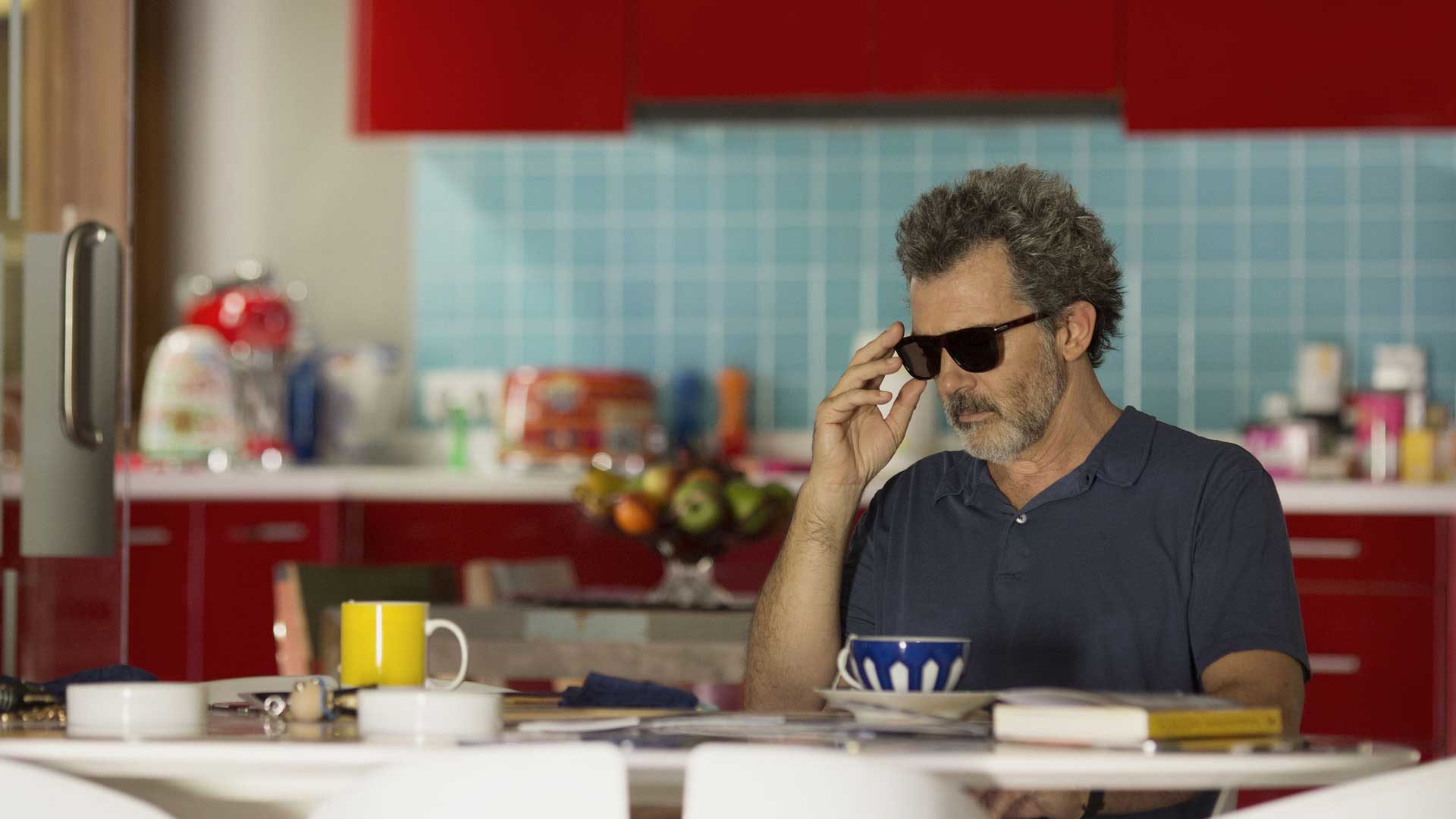
Dolor Y Gloria, the latest movie from Pedro Almodovar, is an unbelievable source of inspiration for cinema and design
Pedro Almodovar, a Spanish filmmaker, director, screenwriter and producer brought us a truly masterful work of art. He is well known for his references to theatre, literature, dance, painting and television in his film work as they play a central role in his storytelling. In his latest movie, Dolor y Gloria, art became the leading narrator from the starting titles and continued throughout the rest of the film, using visual language as part of the plot which became the central aspect in many of the movie’s scenes.
From the starting credits a specific linear, monochromatic font informed us of the visual approach the movie would take, dynamic drawings with bold colors introduced us to the first scenes. Many of the acts are took place inside the home of Salvador (the protagonist), the alter ego of Pedro Almodovar. The views of the autobiographical interiors are mostly static and gave the public an opportunity to view the house full of its many important artworks. These indoor scenes turned out to be more of mini private exhibitions dedicated to beauty and culture.
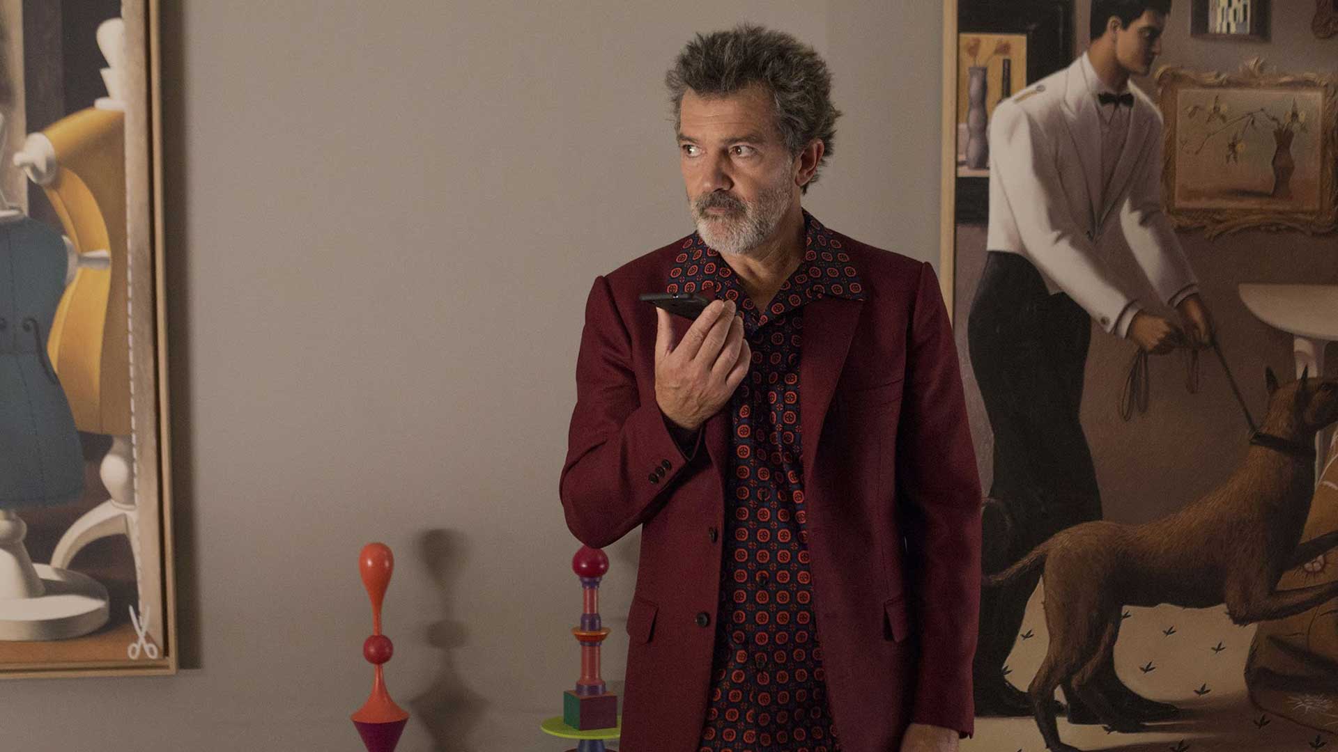
In all of Almodovar’s movies, he chose the furniture and screen props according to the protagonists, in order to add a sense of emersion to the stories. Film after film the director has created a recognizable and unique visual expression, defined by a mix of pop and kitsch styles boasting bold colors that match the design pieces. “Decorations and kitsch objects are fundamental to define my characters and their tastes” he revealed in an interview. To find all the props and build his scenes, he works directly with the Art Director Antxón Gómez, responsible for the Scenography of Dolor y Gloria, Tutto su mia madre, La mala educación, Parla con lei and Carne tremula.
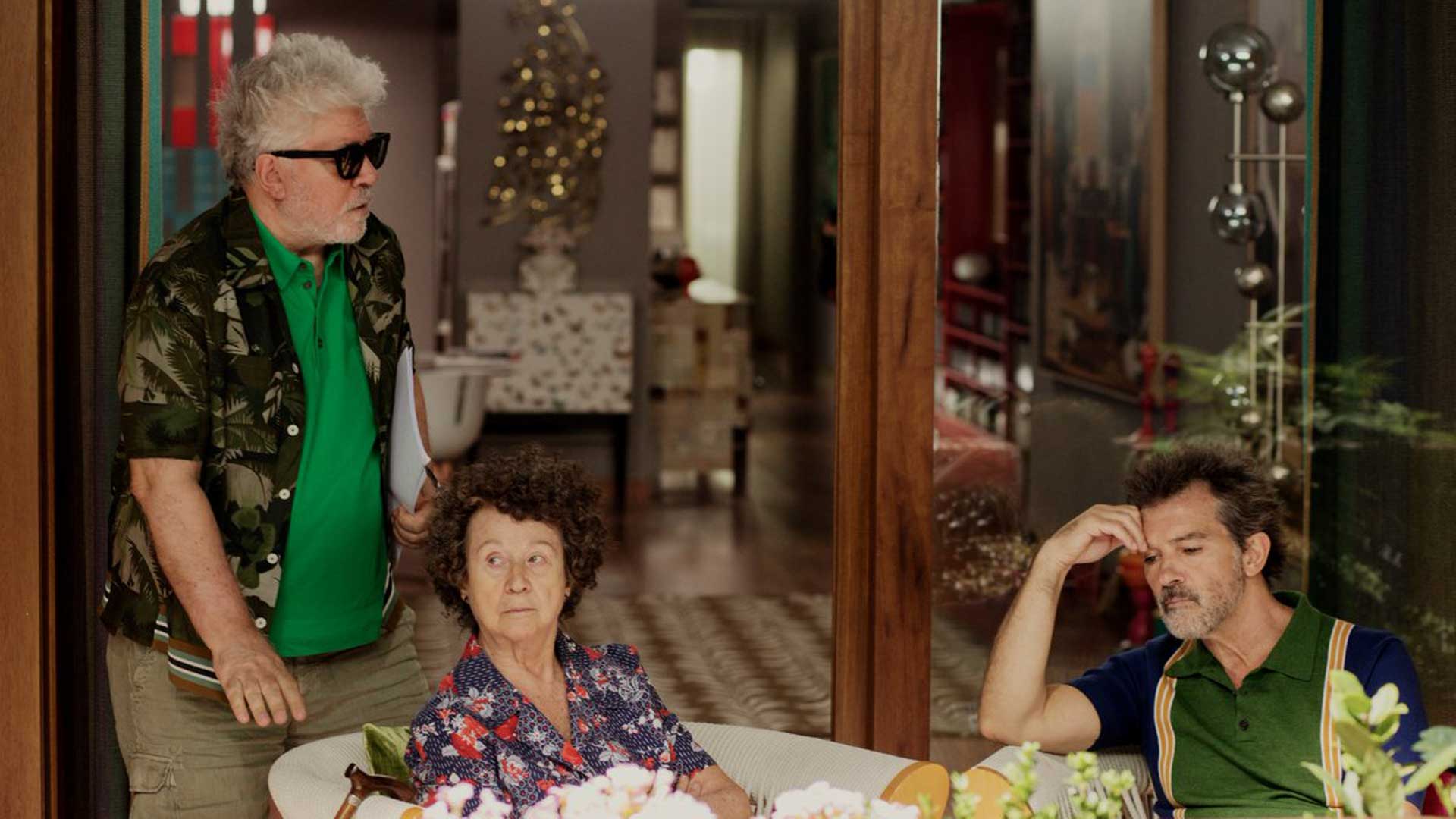
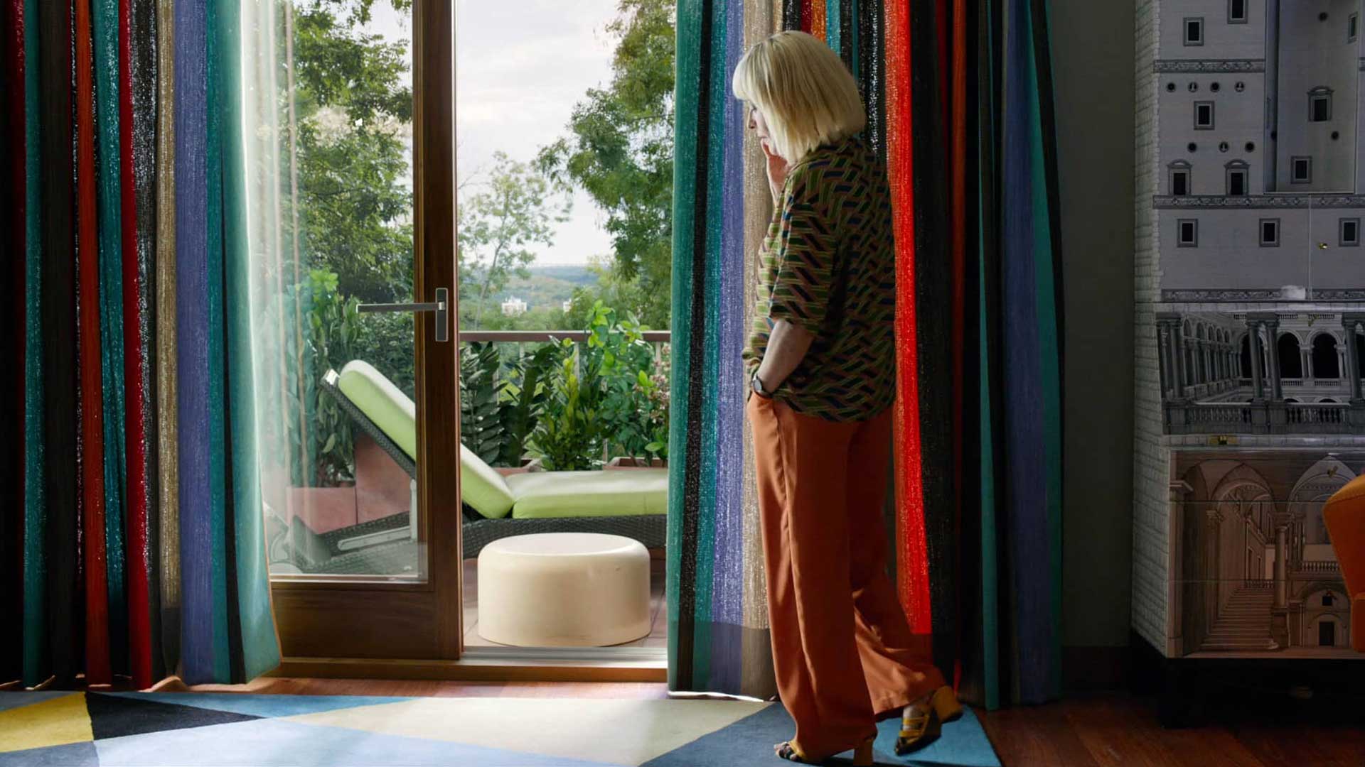
The scenes are recorded inside an apartment with furniture and luxurious objects which aid in forming an eclectic, personal style. While the visual spaces are full of information the scenes remain smooth and seamless: colors present add personality without overwhelming the audience. The scene described is of a home belonging to a collector of sentimental objects displaying a history of his life inside his home. These objects also express the passing of time.
A well trained eye can recognize various design pieces from the previous century, such as the Mexique table by Charlotte Perriand for Cassina, a butterfly wc by Fornasetti, the Eclisse lamp designed by Vico Magistretti for Artemide, recycled wooden shelves by Piet Hein Eek, George Nelson’s clock by Vitra, the Pipistrello lamp by Gae Aulenti for Martinelli Luce, the Buongiorno/Buonanotte vase by Fornasetti and the 637 Utrecht sofas by Cassina.
The artistic elements are not only real, but also present in an abstract form through a collection of books devoted to different disciplines, from cinema to art, design and fashion, exhibited throughout the bookshelves. These details give information about the protagonist, his interests, sensitiveness and artistic passion. Through the discovery and the observation of these details, the audience can learn about the protagonist piece by piece.
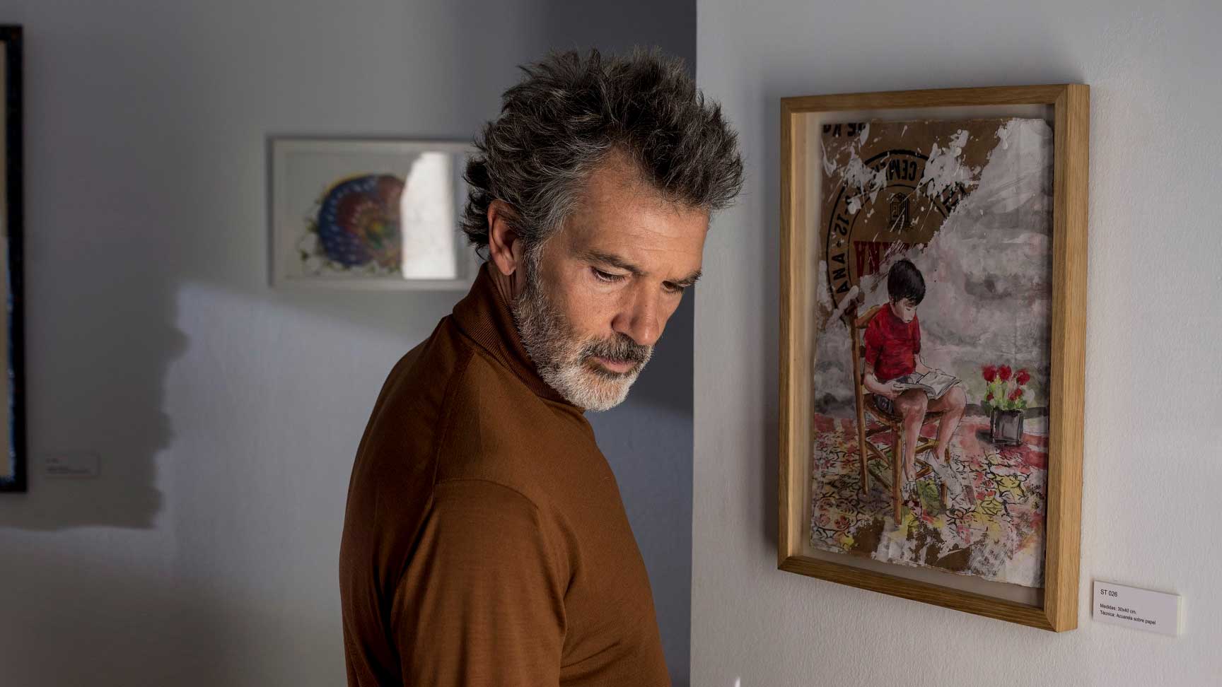
Art remains the fil rouge of the narration till the final scenes. In the last part of the film, Salvador is inside a gallery of popular art and discovers a casual painting of him when he was a child. This interaction communicates to the audience the man he has become from the child he once was, beating his depression and helping him to find serenity and inspiration.
The power of art is often underestimated and can be rather therapeutic. Pedro Almodovar, though the combination of cinema and design continues to tell meaningful stories though his use art and emotional understanding.
